This Little Rock, Arkansas Building Turns 1800s History Into French Flair
You know that moment when a building makes you stop mid-walk and say, wait, what is this place? This Little Rock house has exactly that effect.
It does not fade into the street. It shows up with a steep French-inspired roofline, bold brickwork, and enough old-world detail to make you take a second photo before moving on.
The outside sets the tone, but the inside keeps the story going. Painted ceilings catch your attention fast.
The woodwork feels warm and serious, like it has watched generations pass through the rooms. Every space has a little character, not in a polished showroom way, but in a lived-through-history way.
That is why it works so well as a travel stop. It gives you architecture, mood, and a strong sense of Arkansas history in one place.
Keep reading, because this house has plenty more to say once you start looking closer here today.
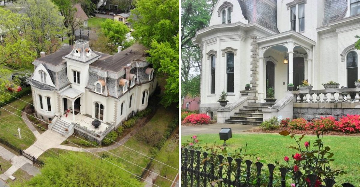
Mansard Roofs And Old-World Charm

Few architectural features announce a building’s personality quite as boldly as a mansard roof, and this one means business.
The steeply angled, patterned slate mansard roofline rises with a confidence that feels almost theatrical, borrowing its design language straight from 19th-century French architecture.
Named after French architect Francois Mansart, this roof style became wildly popular in America during the Second Empire period of the 1860s and 1870s.
As you stand on the street and tilt your head upward, you sense that whoever built this home wanted to make a statement that would last generations.
The dormers cut into the roof add vertical rhythm, breaking up what could otherwise feel heavy and instead creating a layered, almost theatrical silhouette against the Arkansas sky.
What strikes me most is how well the roof has held up visually, looking dignified rather than tired after all these years.
Past preservation efforts have helped keep the exterior faithful to its historic character in a way that earns admiration.
Old-world charm is often talked about loosely, but here it is built right into the roofline itself. The entire structure feels like a page torn from a Parisian architectural catalog at The Villa Marre, 1321 Scott St, Little Rock, AR 72202.
A Storybook Facade On A Quiet Street

As Scott Street comes into view, the first glimpse of this facade makes you slow your pace, almost instinctively.
The front of the building reads like something out of an illustrated history book, with its symmetrical layout, decorative brackets, and richly detailed exterior trim all working together in careful harmony.
The street itself is calm and tree-lined, which makes the home’s presence feel even more dramatic by contrast, as if the neighborhood is quietly deferring to its most distinguished resident.
I remember standing on the sidewalk and just taking it all in for a moment before even thinking about stepping closer.
A composed elegance runs through the facade, never shouting for attention but earning it steadily the longer you look.
Visitors familiar with the television show Designing Women will recognize this exterior immediately, since the building served as the backdrop for the show’s memorable opening sequences.
That pop culture connection adds a fun layer of recognition to what is already an architecturally compelling sight.
This is where the storybook facade has stood since the early 1880s, still commanding attention from the street.
Walnut Staircases And Painted Ceilings

The first step inside this historic home feels completely different from admiring it on the street, and the interior absolutely holds its own.
The walnut staircase is the kind of feature that makes you reach out and run your hand along the banister without even thinking about it, because the craftsmanship invites that kind of tactile appreciation.
Dark, richly grained walnut was a prestige choice in the 1880s, signaling both wealth and refined taste, and it still communicates both of those things clearly today.
Above your head, the painted ceilings add another layer of visual drama that you simply do not expect in a residential building of this era and region.
Decorative ceiling work in Victorian homes was often reserved for the most formal rooms, and here it creates an atmosphere that feels ceremonial.
The scale and beauty of the interior are easy to understand right away, especially once the staircase, ceilings, and woodwork begin competing for your attention.
The combination of dark woodwork below and painted detail above creates a visual conversation between floor and ceiling that keeps your eyes moving constantly.
Every inch of this interior feels intentional, crafted by hands that clearly took pride in their careful work today.
Second Empire Details In The South

The Second Empire architectural style arrived in America riding a wave of enthusiasm for all things French, and it found a surprisingly enthusiastic audience in the American South.
What makes this building so interesting is that it represents a real commitment to that imported style rather than a watered-down regional interpretation.
The decorative brackets beneath the roofline, the carefully proportioned window surrounds, and the layered cornice details all point to a builder who understood the vocabulary of the style and applied it with real skill.
First commissioned in 1881 by a wealthy immigrant family, this home clearly reflected ambitions that extended well beyond basic shelter or simple social display alone.
The choice of Second Empire style was a deliberate cultural statement, connecting the household to the prestige of European architectural fashion at a time when that association carried serious social weight.
A style commitment this strong, this far south and this far inland, still feels surprising and gives the building a quality of unexpectedness that rewards close attention.
The details are not merely decorative flourishes tacked on for show; they are structural and proportional elements that define the entire character of the composition.
This is Southern architecture with a distinctly cosmopolitan accent.
Brick Walls With Decorative Flourishes

Brick construction in the 1880s was a mark of permanence, and the walls of this building carry that intention forward into the present with quiet authority.
Up close, the brickwork reveals a level of care that goes well beyond simple utility, with decorative elements integrated into the facade rather than applied as casual afterthoughts over long time.
Concrete quoins at the corners give the structure a crisp visual definition, while the brick detailing around the windows creates a layered, almost sculptural effect that rewards careful inspection.
I found myself photographing small sections of the wall just to capture the texture and the interplay of shadow across the surface on a sunny afternoon.
A building whose materials have aged gracefully rather than simply aged is deeply satisfying, and this one falls firmly into that category.
The warmth of the red brick against the white painted trim creates a color palette that feels both classic and inviting, never cold or austere.
Decorative flourishes in historic brickwork are often underappreciated because they require you to slow down and actually look, but the reward for that patience is considerable here.
These walls have witnessed more than 140 years of Little Rock history and show no signs of losing their composure.
A Historic Home With Parisian Hints

A building designed to evoke somewhere else has a very specific visual feeling, and this one pulls it off with surprising conviction.
The Parisian hints here are not superficial; they are embedded in the structural logic of the design, from the proportions of the roofline to the rhythm of the window placement.
France’s Second Empire period under Napoleon III produced a wave of ambitious urban architecture, and American builders absorbed those ideas eagerly, reinterpreting them in brick and timber across the Atlantic.
At this address, that transatlantic conversation produced something distinctive and memorable, a home that still feels both rooted in its Arkansas context and connected to a broader international tradition.
The formal symmetry of the front elevation has a composed, almost ceremonial quality that you might associate with French-influenced 19th-century design rather than a typical Southern residential street in scale.
What I find most compelling is that the Parisian influence never feels forced or costume-like; instead, it has been absorbed into the building’s identity so thoroughly that it simply feels right.
Visitors who know their architectural history will spot the references immediately, while those who do not will simply feel that something here is unusually refined.
Either way, the impression is a lasting one.
Vintage Corners Full Of Character

Vintage character in a historic building is not just about age; it is about the accumulation of choices made by people who cared deeply about their surroundings.
Every corner of this home seems to hold something worth noticing, whether it is the profile of a door surround, the way light falls across a plaster wall, or the particular weight of a period hardware detail.
Even the transitions between rooms feel considered, with moldings and trim work carrying a consistent design language from space to space.
That kind of interior coherence is actually quite rare in historic homes, where renovations and changing tastes often leave a patchwork of competing periods behind.
Here, the historic aesthetic still holds together with impressive integrity, creating an atmosphere that feels immersive rather than merely decorative.
The scale of the entertaining spaces is generous without feeling overwhelming, striking a balance that makes the home work equally well for an intimate gathering or a larger celebration.
Small details do a lot of the storytelling here, especially the trim, hardware, wall surfaces, and room-to-room flow that make the interior feel carefully assembled instead of casually preserved.
Vintage corners like these are the reason people travel specifically to see historic architecture rather than just read about it.
Elegant Windows And Timeless Texture

Windows in Victorian-era architecture were never just functional openings; they were carefully composed design elements that contributed as much to the character of a facade as any other feature.
The windows here carry that philosophy through with real commitment, each one framed with decorative moldings that give the exterior a richly textured surface quality.
The proportions are tall and stately, which is typical of the period and which creates a verticality that reinforces the building’s overall sense of upward ambition.
From across the street, the windows create a regular, almost musical rhythm that gives the composition a sense of order beneath all its decorative complexity from outside today.
Up close, the detailing around each window opening reveals the kind of craftsmanship that simply cannot be rushed or replicated cheaply, and knowing that these elements have survived intact for over 140 years makes them feel all the more precious.
The texture of the exterior as a whole, brick, painted trim, glass, and molding, creates a layered visual experience that changes with the light throughout the day.
Morning light picks out the shadow detail in the moldings, while afternoon sun warms the brick to a deep amber that makes the whole facade glow.
Timeless texture is not a phrase I use lightly, but this building earns it completely.